
Homepage Revamp
CoHo is a tech startup that aims to provide a superior living experience to millennials in India, focusing on 3C of the customers, Comfort, convenience, and community. I would like to thank the CoHo design team for guiding me throughout the project.
Problem

Relocating is Challenging! Educating populace, the aim of 'Coliving' as a business model, to attract the potential residents towards an opportunity for better living facilities accompanying by greater leeway to socialise and interweave with the place, in company with showcasing brand as a substantial fit for angel or venture capital funding. Perceiving that concept is yet new to India.

Task
Given that, the original design of the CoHo website is unable to express the true essence of the brand. Revamping, the user experience of the home page to attract and interact with potential clients and investors.
My Process


User Research
Every design target an audience. The initial step we took after the exercise is to identify the target audience to understand physiology and intentions.
Target Audiance
CoHo a tech startup that aims to provide a superior living experience to millennials in India.
For young professionals, bring fully-furnished comfortable homestay with a community of like-minded people. They aim at providing a hassle-free living experience driven by high class, tech-enabled, services so that residents don't just live but enjoy living.
Four Areas of Focus
In our initial conversation with the CoHo team, we heard about what they felt were the biggest issues with the website. We then validated and sized these concerns with further research, as explained below.
In our initial conversation with the CoHo team, we heard about what they felt were the biggest issues with the website. We then validated and sized these concerns with further research, as explained below.

_edited.jpg)
Phase I: Research
Phase Objectives
-
Validation: are the 4 areas of focus the real issues we need to address in this project? Is there another issue that requires more attention?
-
Sizing: how major are the concerns within each area? Which areas should we prioritize?
Key Takeaways
-
Navigation was the #1 problem on the website
-
The content was the #2 problem on the website
-
The current website design is non-responsive and very inaccessible
Survey
Through this survey, I aimed to probe into each of our three themes and collect data directly from the residents. Understanding, the required features or content for the website.
Key Elements of the brand
Community Events


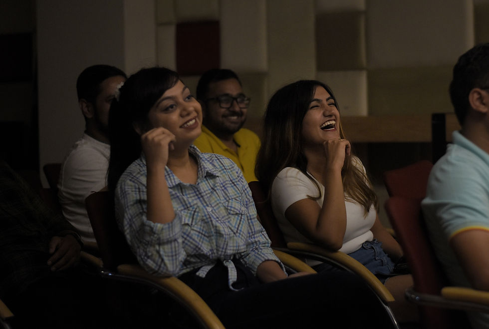
A CoHo resident becomes a part of the larger family. The community organizes various events, sessions and meetups for all the residents, so they don’t feel a dull moment after work, on holidays or weekends.


Online Concierge
We are a touch away for any queries regarding your stay.
An app that simplifies everyone’s life in a gated community, from residents and management committee members to security guards and facility managers. Packed with outstanding features, it reduces many hassles—
Authorizing delivery executives’ entry,
Paying maintenance bills,
Raising a ticket to the facility manager – to a single click.

The Virtual Walk
CoHo is a tech-enabled co-living platform which is transforming the way millennials experience long stay living in India.
Phase II: Information Architecture and Components Based Design
We decided that if we are targeting different segments, then why have a similar journey for both instead we can divide them from the homepage to give them the best experience and easy way out for what they are looking for.

Market Research
A quick research about the market and the competitors, which helps in analyzing what is important and what mistakes other competitors are making.

User Persona

Female
Working / Students
Age - 19 - 30
Caring, Self-worthy,
Independent
and feminist.
Male
Working / Students
Age - 19 - 35
Party Animal,
Lively and focused
Colors & Fonts

Low Fidelity Wireframes


The Virtual Walk
A Virtual tour through the properties
for a better user experience.
Key Elements
The section represents the elements
of the company to attract
a wider audience.


Location
The section represents the desired
locations to the audience, making it
hassle-free.
Popular Spaces
The section represents the popular
locationsto the audience, making it
a better user expecice.


Final Recommendations
In our final presentation to the CoHo, we provided specific recommendations for each area of focus based on our findings
Information Architecture
-
Continue developing the site map
-
Have multiple paths to content, but have a consistent URL format to improve SEO
-
Confirm subsections of the site map with users
Content
-
Have a strategy for content creation and management; website content should be added in a concise and intentional manner
-
Combine content strategy with user research by asking users to prioritize content as they would like to it
-
Link to external resources to minimize the number of broken links and upkeep efforts
Design
-
Parallelize the design process between mobile and desktop platforms; the mobile website should not just be a smaller version of the desktop site.
-
Use the components based design approach to minimize design effort while maintaining a consistent style
